Lickd Case Study: Project Jargon
Lickd is the world’s biggest catalog of music for content creators. Whilst providing an eCommerce platform to purchase licenses for commercial and stock music, Lickd also provides an integrated license clearing solution for online video platforms, removing the problems of copyright claims and demonetisation.
Role
Product Designer
Project Goal
Minimise the anxiety around copyright users face when purchasing a music license for online video content, improve checkout conversion and reduce the amount of post-purchase support requests.
Why is it a problem?
The music industry is full of complexity when it comes to copyright; a world full of jargon and legal language that content creators often struggle to navigate. With the fear of demonitisation on the videos they publish, they often opt for copyright free library music to save the copyright issues further down the line. But with proof that commercial music improves video engagement, how do we convince creators it’s all taken care of?
Target Users
Content creators
- Diverse video categories
- Varying audience sizes
Constraints the team faced?
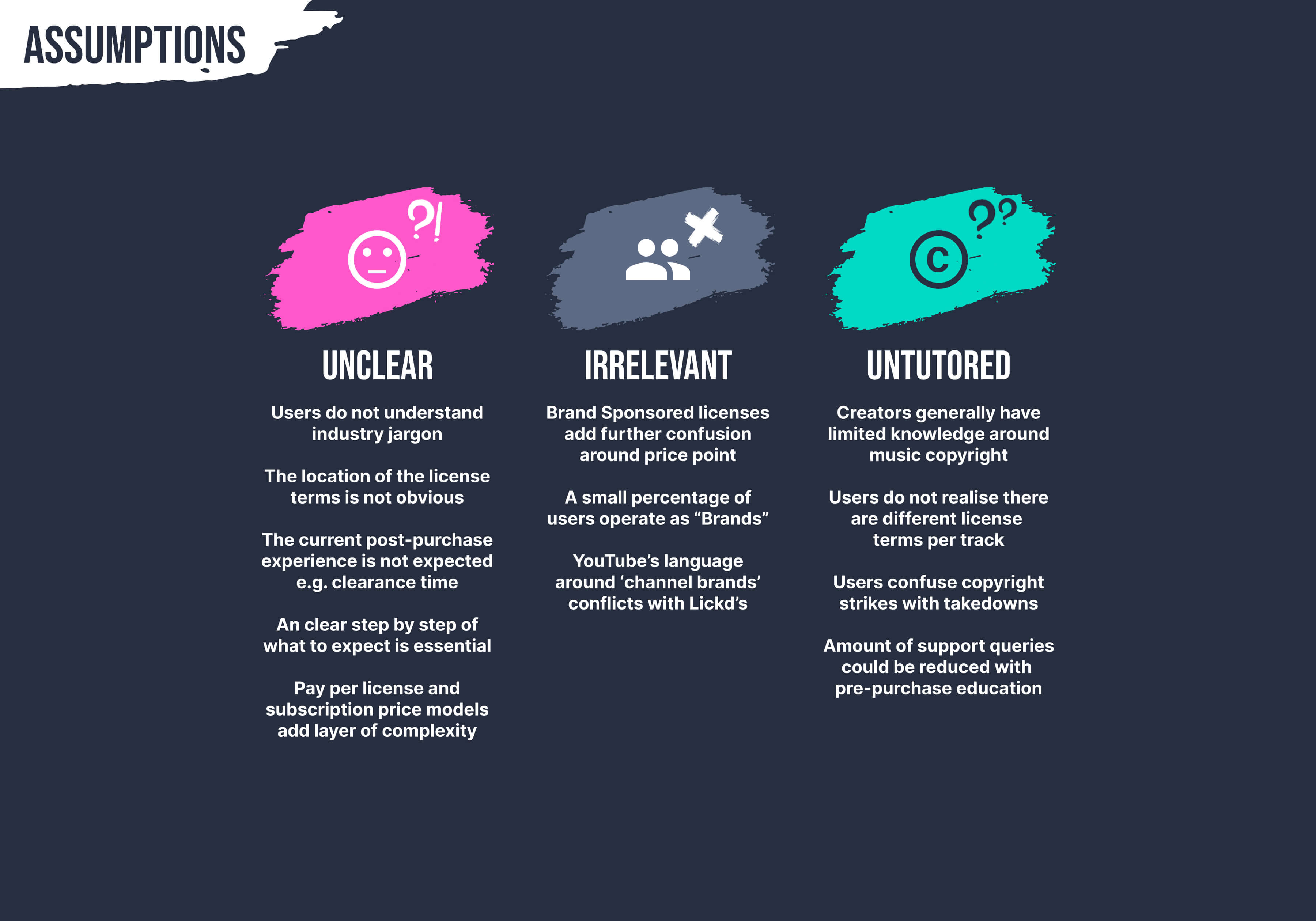
- Lickd’s business model has two types of plans due to the license agreement with the record labels and partners; pay per license for commercial music (from the labels) and a subscription plan for unlimited stock music (from Audio Network).
- There are also different license agreements with between record labels which affects post-purchase clearance process e.g. lead times
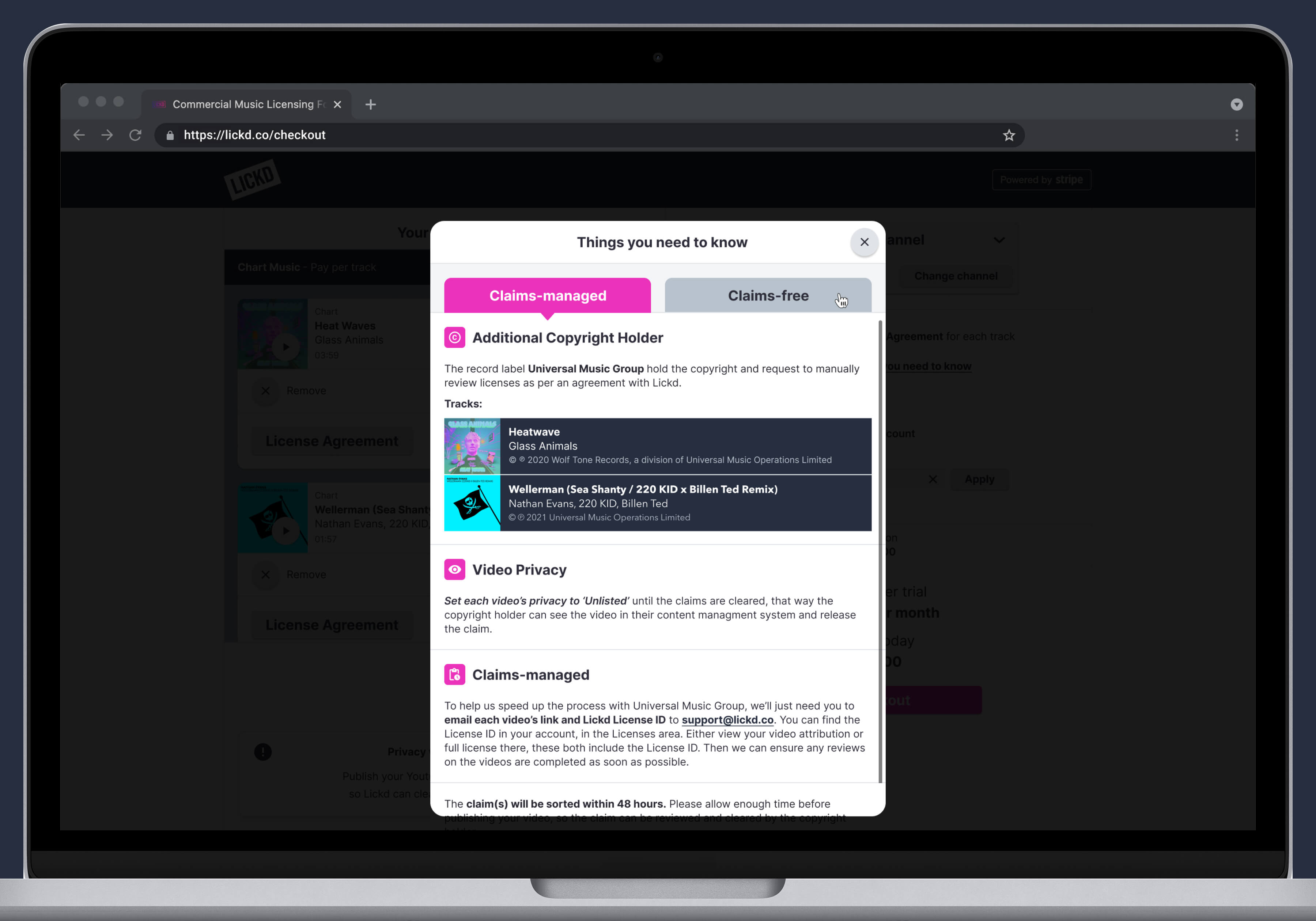
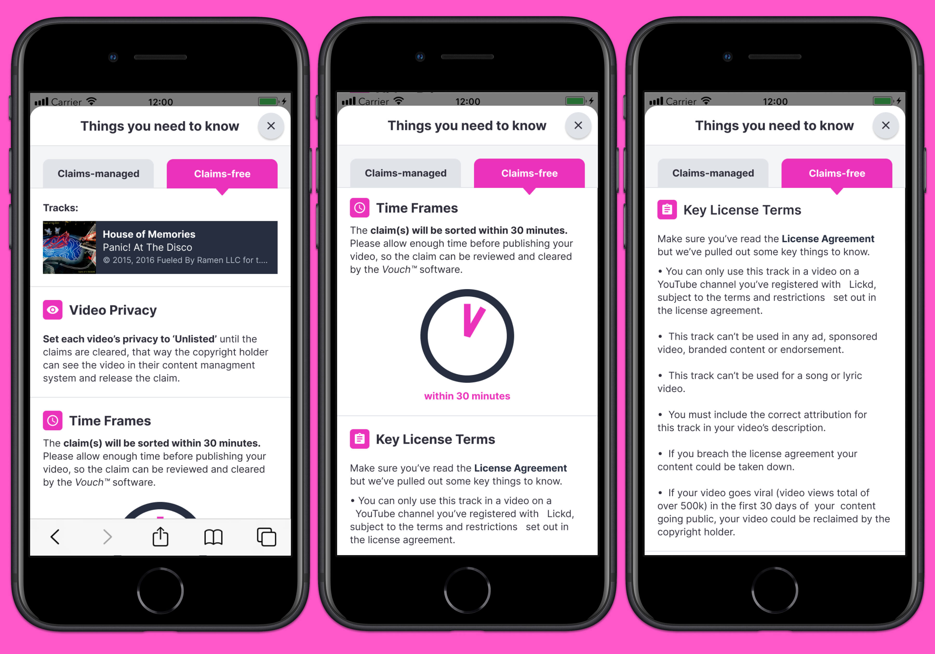
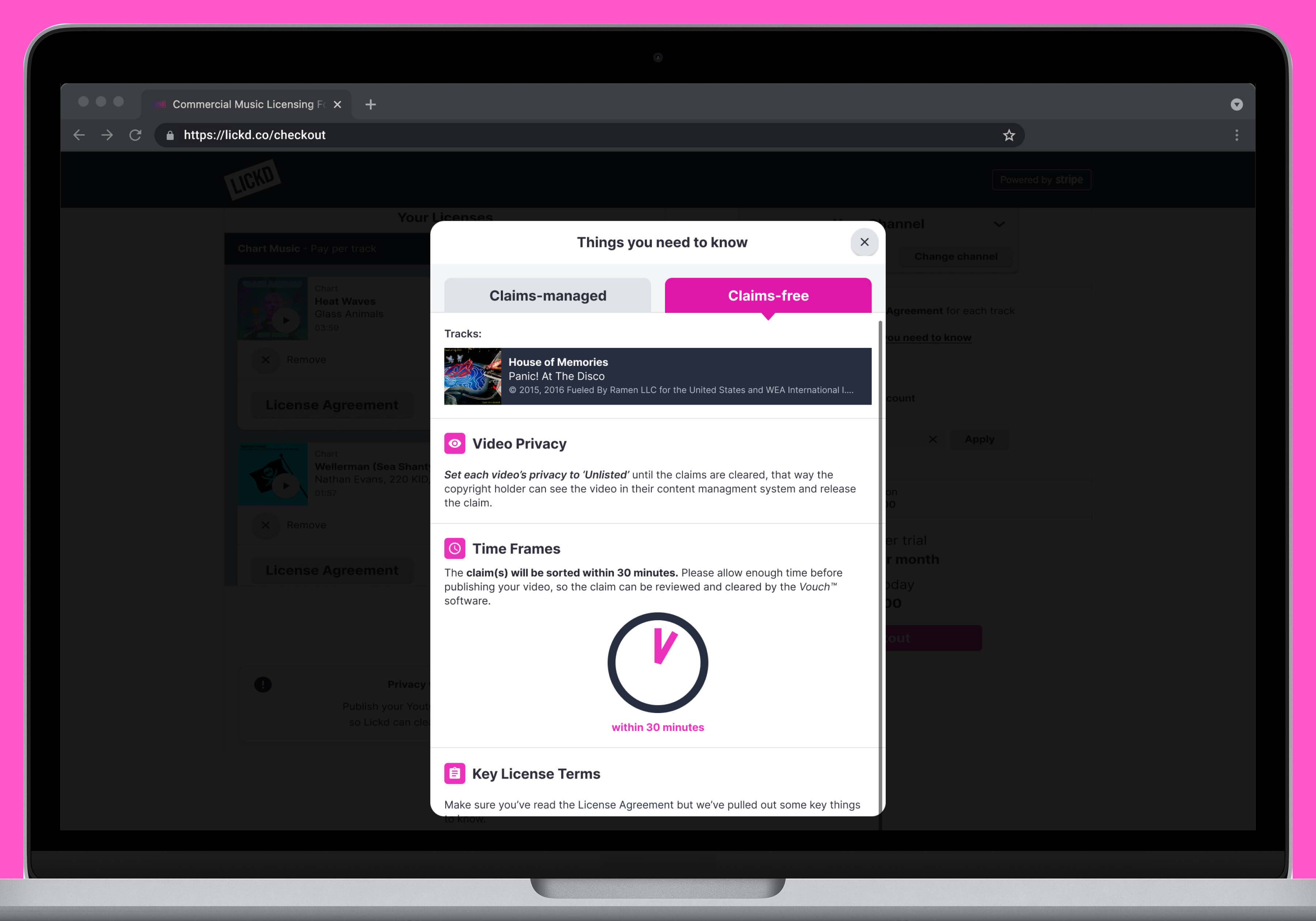
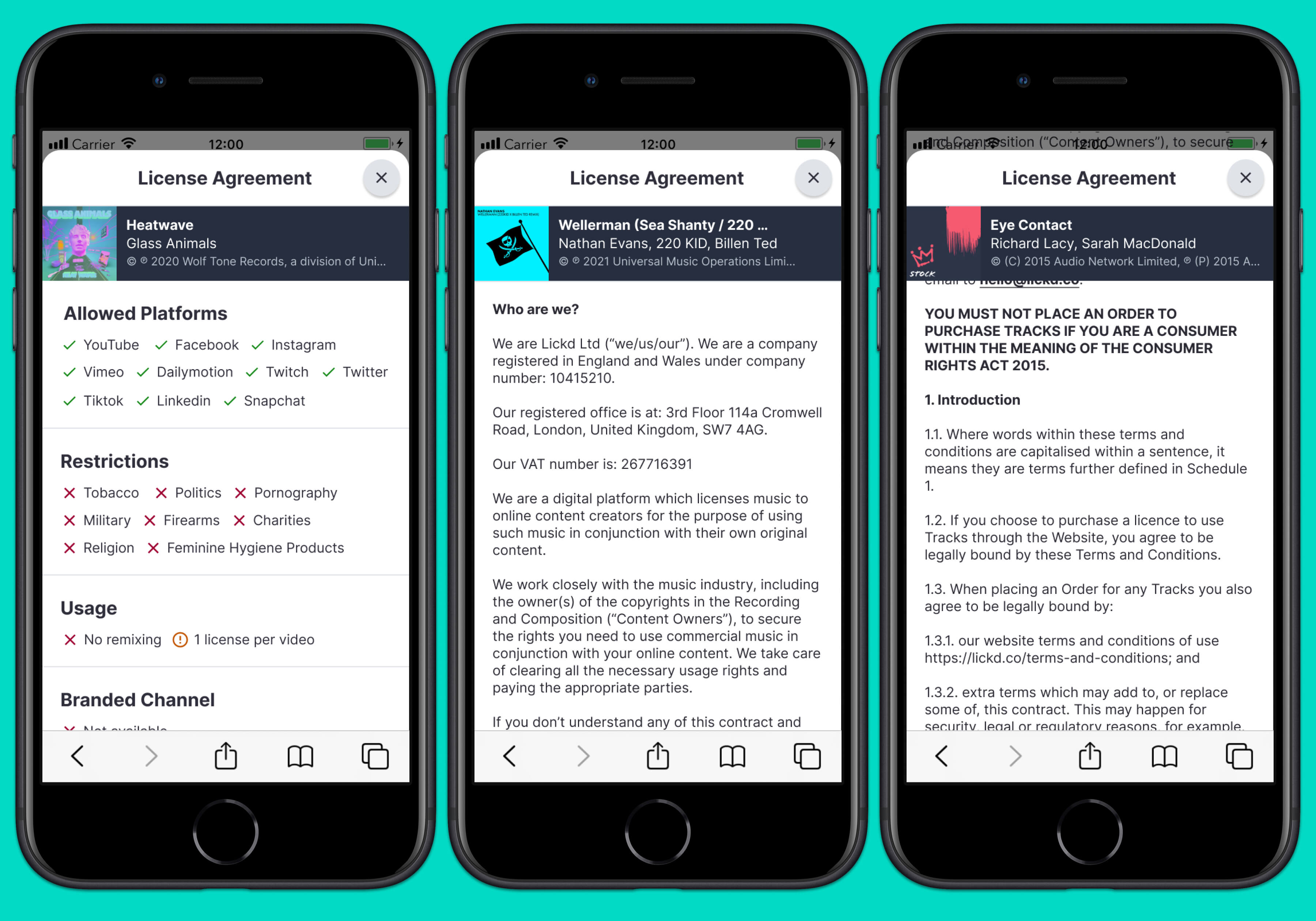
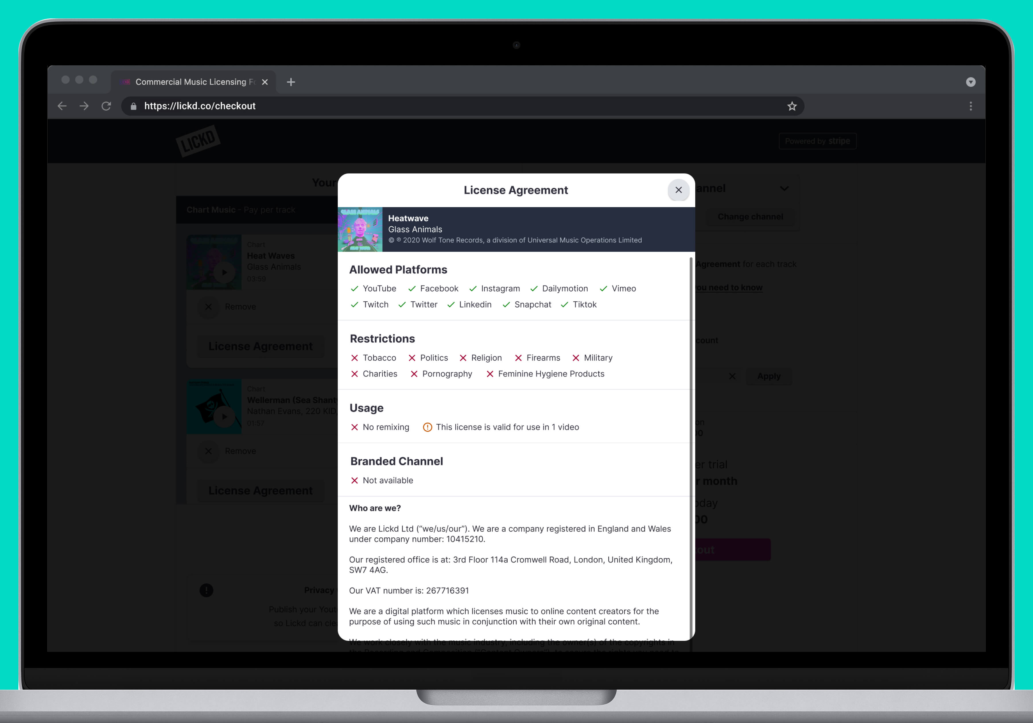
- Track license agreements also have their own set of terms as there are additional conditions set by the label or publisher, which are terms that the user needs to be aware of
Discovery Phase
The product team consisted of a Product Manager, a UX Researcher, myself, a frontend engineer and a member from another department (rotated) to ensure we weren’t missing anything. Together we started to workshop over a few sessions discussing what the assumptions were based on previous insights from users and across the business internally. This allowed us to build a framework in which we could start planning the design and research with user pain points and business needs in mind throughout the process.
User Centric Approach
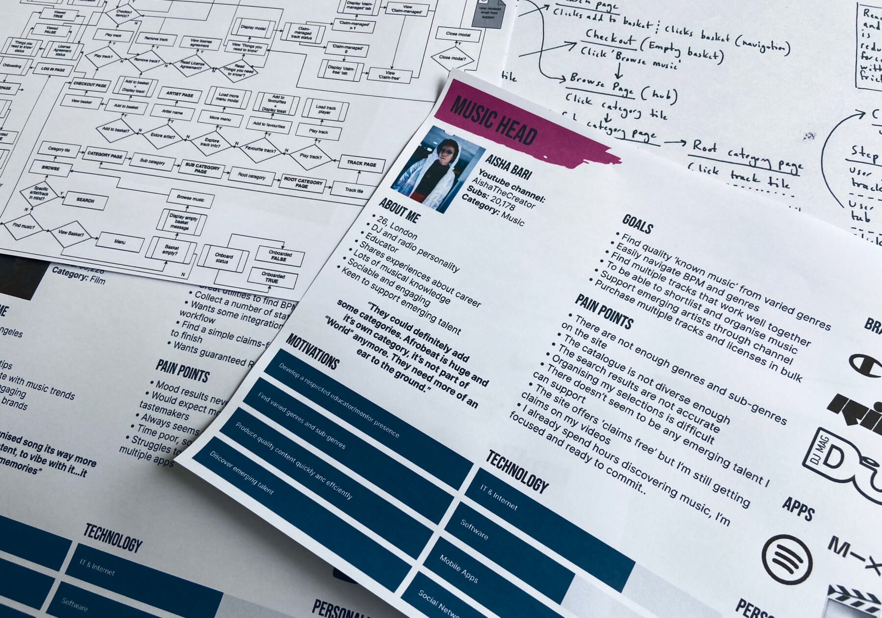
With the material from the discovery session at my disposal, I could start to flesh out some short-hand user flows, consistently referring to our site map, and holistic user flow across the platform. I would also work with the User Researcher to ensure I was heading run the right direction and that the user stories were being resolved and I hadn’t missed anything from the discovery sessions.
Personas, user flows and stories
Ideation and Experimentation
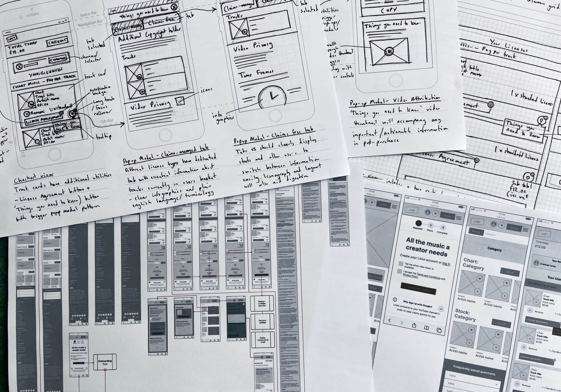
Once the product team had a good understanding of the different user stories and user flow, it was then my job to articulate this research into device-specific flows - from sketches to wireframes. Further discussions with the team allowed for quick iterations of the screenflow before the prototyping stage had begun.
Sketches, wireframes and screen flows
Building the Prototype
Once I had taken the team through the wireframes and user flows, it was my job to then build the prototype using Sketch. The prototype aimed to capture the key views in the screen flow that caused the most friction previously. We also wanted to showcase any new features that we thought could make a difference based on our work in discovery and get a sense of what the users liked and didn’t like, plus observe any moments of lapse or confusion during interaction which we would then iron out later on. It was then my job to start the planning of the user testing sessions. With the prototype ready, I could start to document what features needed to be tested, what the assumptions were and how we should validate the successes and failures. This documentation could then be passed onto the UX Researcher in order for them to start building the script and tasks.
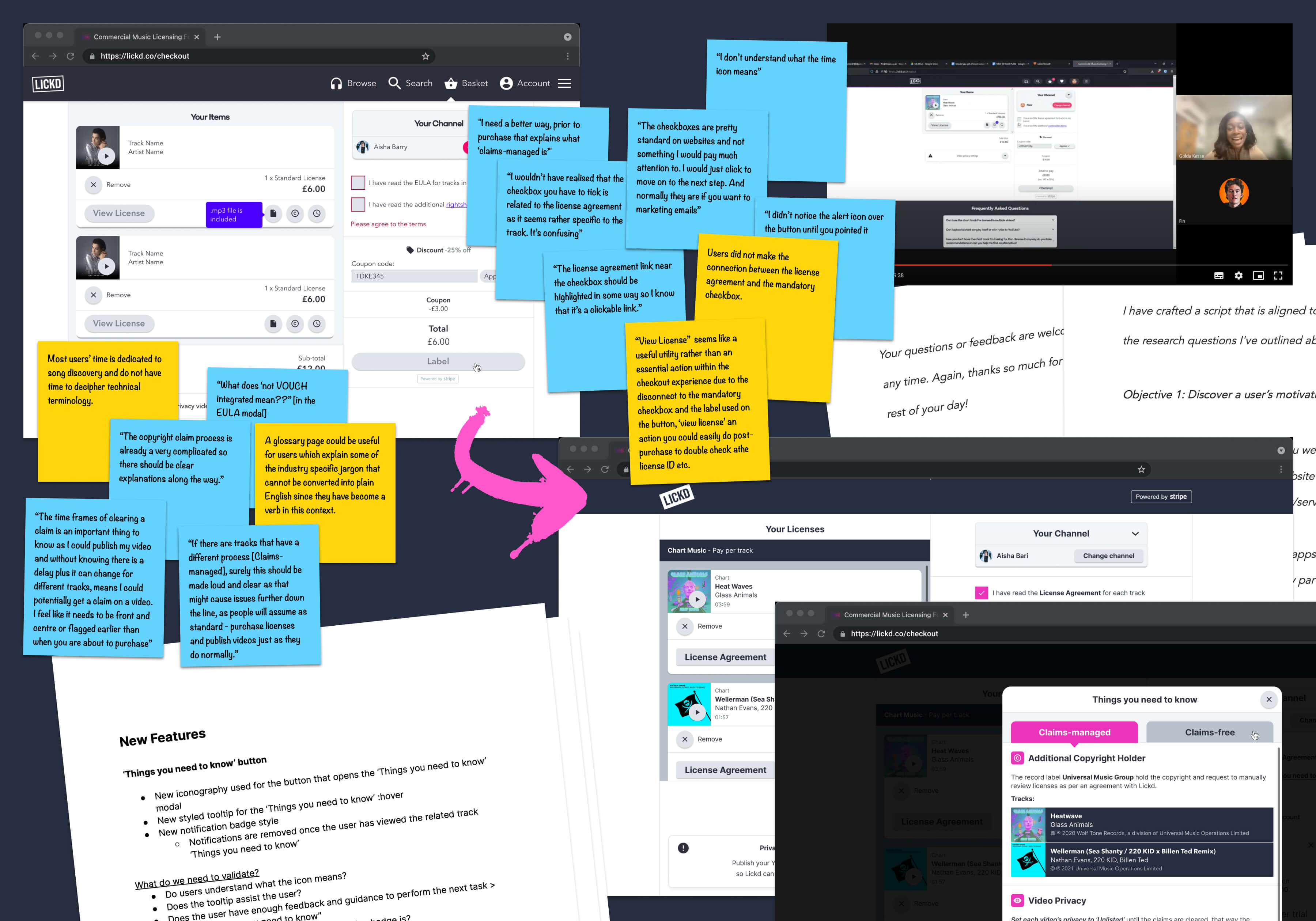
User Insights and Testing
At Lickd, we decided to build an ‘Innovation Hub’ which involved recruiting a community of creators of varying audience sizes and categories from which we could gather insights on a regular basis. We hired a UX Researcher to come in and set this up and it was a huge success. Before their arrival (in the first year) it was me single handily planning, conducting and synthesising all of the user insight sessions which worked well, but with the UX Researcher on board meant we could conduct more studies regularly. Working together we could start planning the insight sessions, based on the insights we had, we had an idea of what features or tasks could be run. This allowed the UX Researcher to build outreach material and scripts for each session. The sessions themselves were run in 60-minute one-on-one sessions with the UX researcher leading the conversation and a note taker being present, usually myself. The UX Researcher would also conduct online surveys to get a further reach than the group we had regular contact with. This would also give us some more quantitive data alongside the qualitative data collated from the hub members. We took each user through the current checkout through a set of tasks and open questions related to our original assumptions, inbound or previous insights collated from our product management and insight tool ProductBoard, all of which had already help us build a better picture during the discovery phase.
Results
After each session, data was collected and affinity mapped by the UX Researcher and through team sessions meant we could quickly see what features of tweaks to the UI or copy that needed the most attention. As mentioned previously, we ended up iterating a few times to get to the final prototype everyone felt addressed the user and business needs and get us close to the success metrics numbers we had set in discovery. At this point, through feature prioritisation we could weigh up what features were essential for 'now' and could fulfil the most user needs given the resources we had, setting aside the other features for 'next'. Now we could finalise the final prototype and prepare it ready for handoff to the developers with any annotations. The handoff would involved a couple of walk through sessions to show the prototype but also for the UX Researcher to give more context of how we got to where we were and summarise the feedback collated during the insights phase. Since we involved the engineering team in discovery, iterations and feature prioritisation there were no surprises in what we should build.
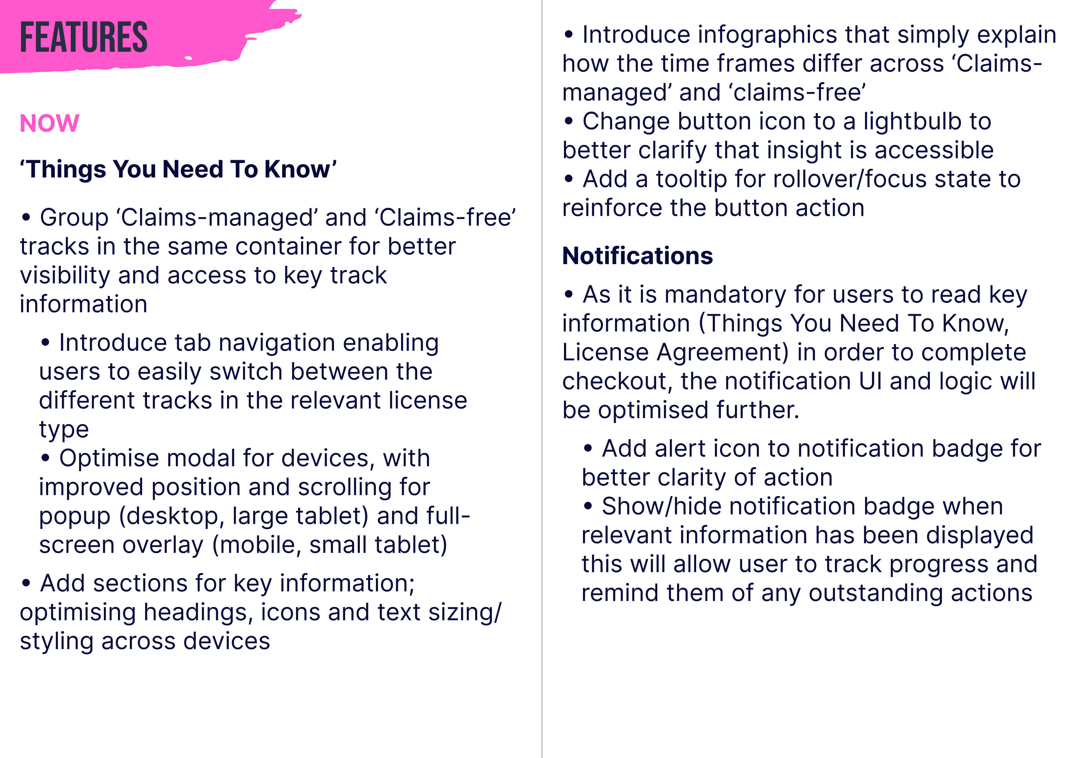
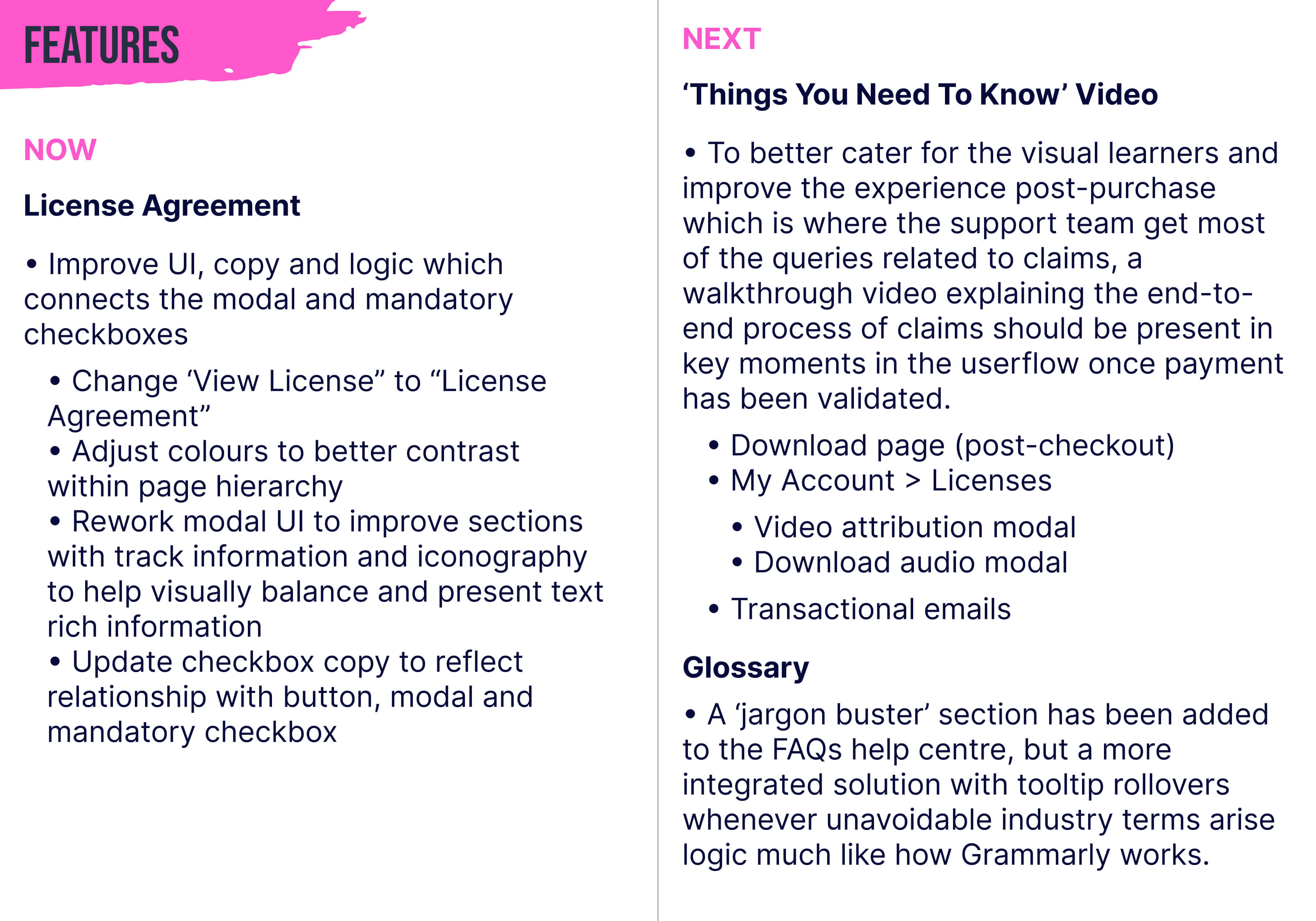
Feature prioritisation - Now
Feature prioritisation - Next
Designs
Once we had synthesised the results, I could then iterate the designs to reflect what new features or improvements could be made across mobile and desktop. Now it was important to produce high-quality UI, plus get the project files ready to hand off to the engineers. Handoff would normally include a couple of prototype walkthrough sessions with the front-end engineers led by myself. Alongside the sessions would be some annotated specs within the prototype that the engineers could refer back to. It was then important to work closely with the engineer to iron out any build or accessibility issues during the build.
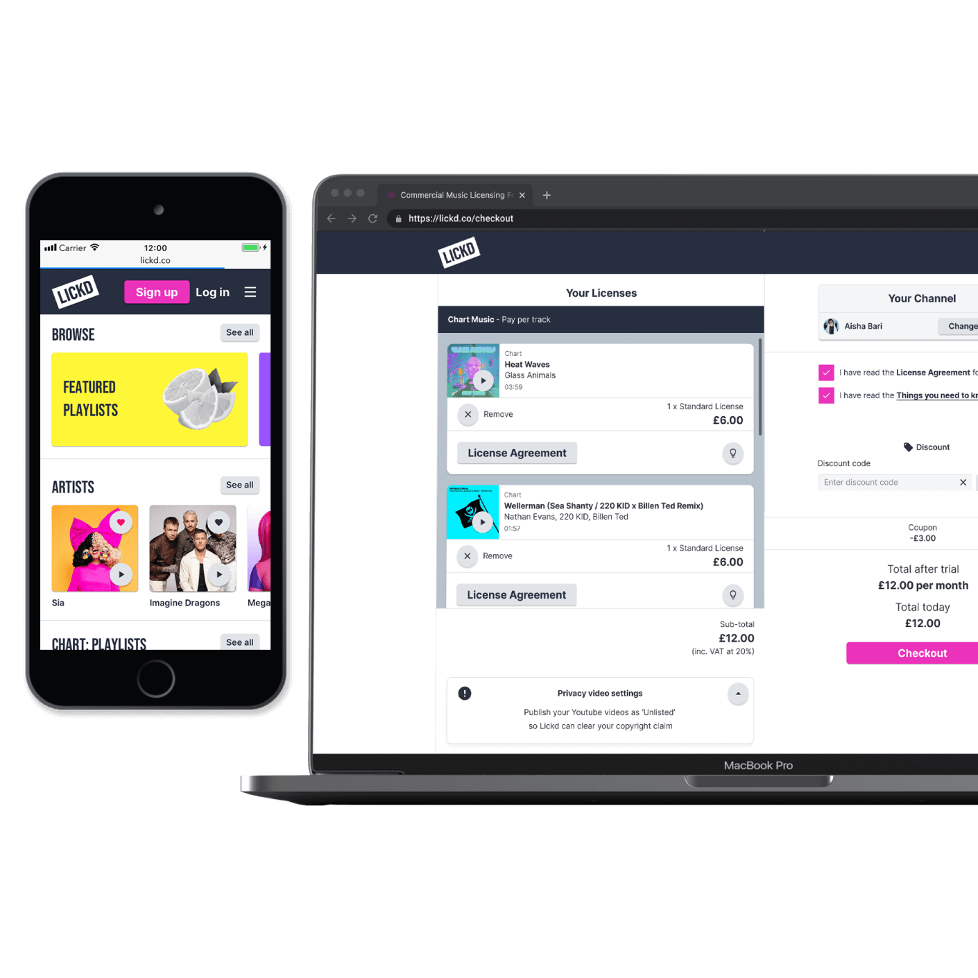
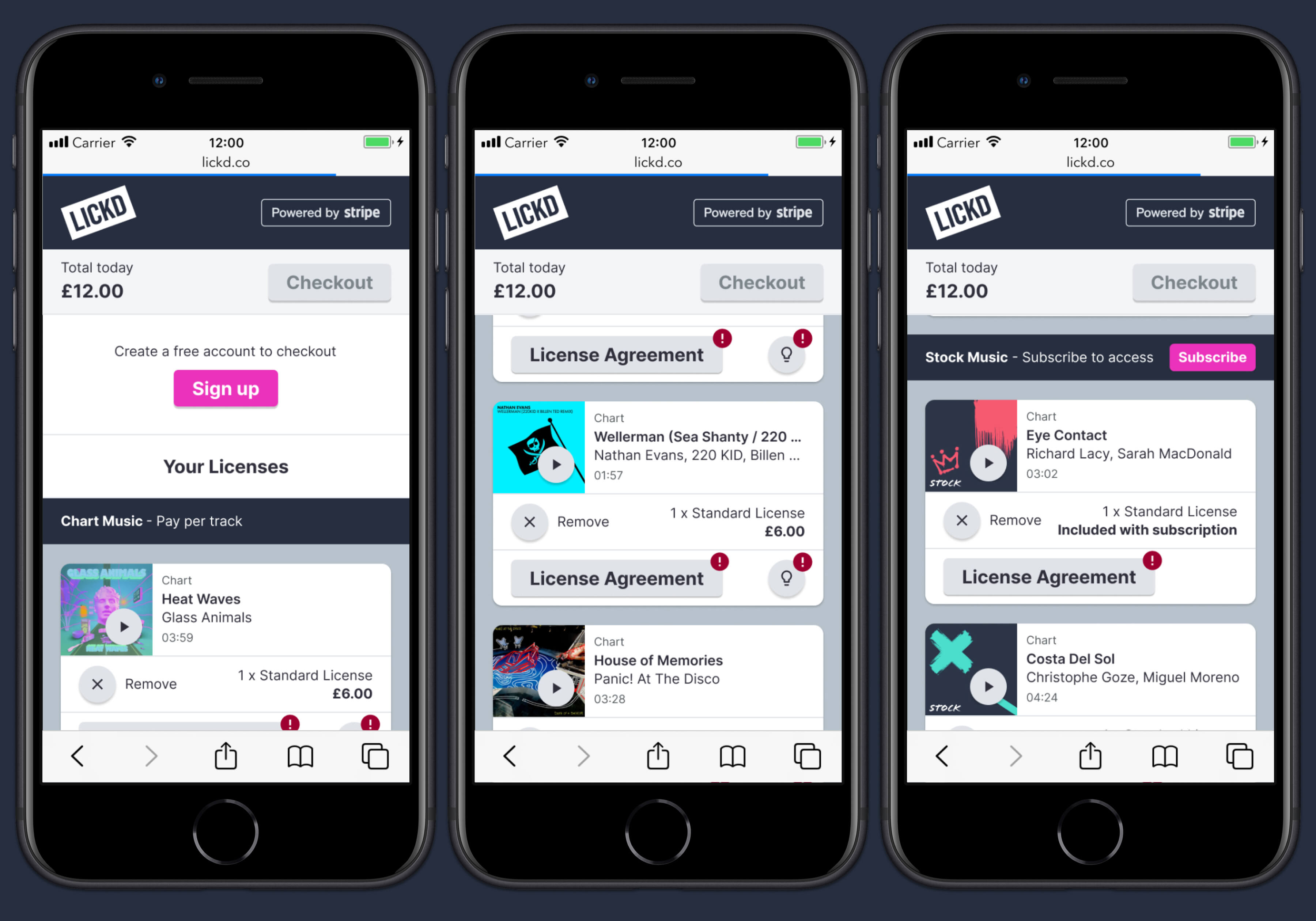
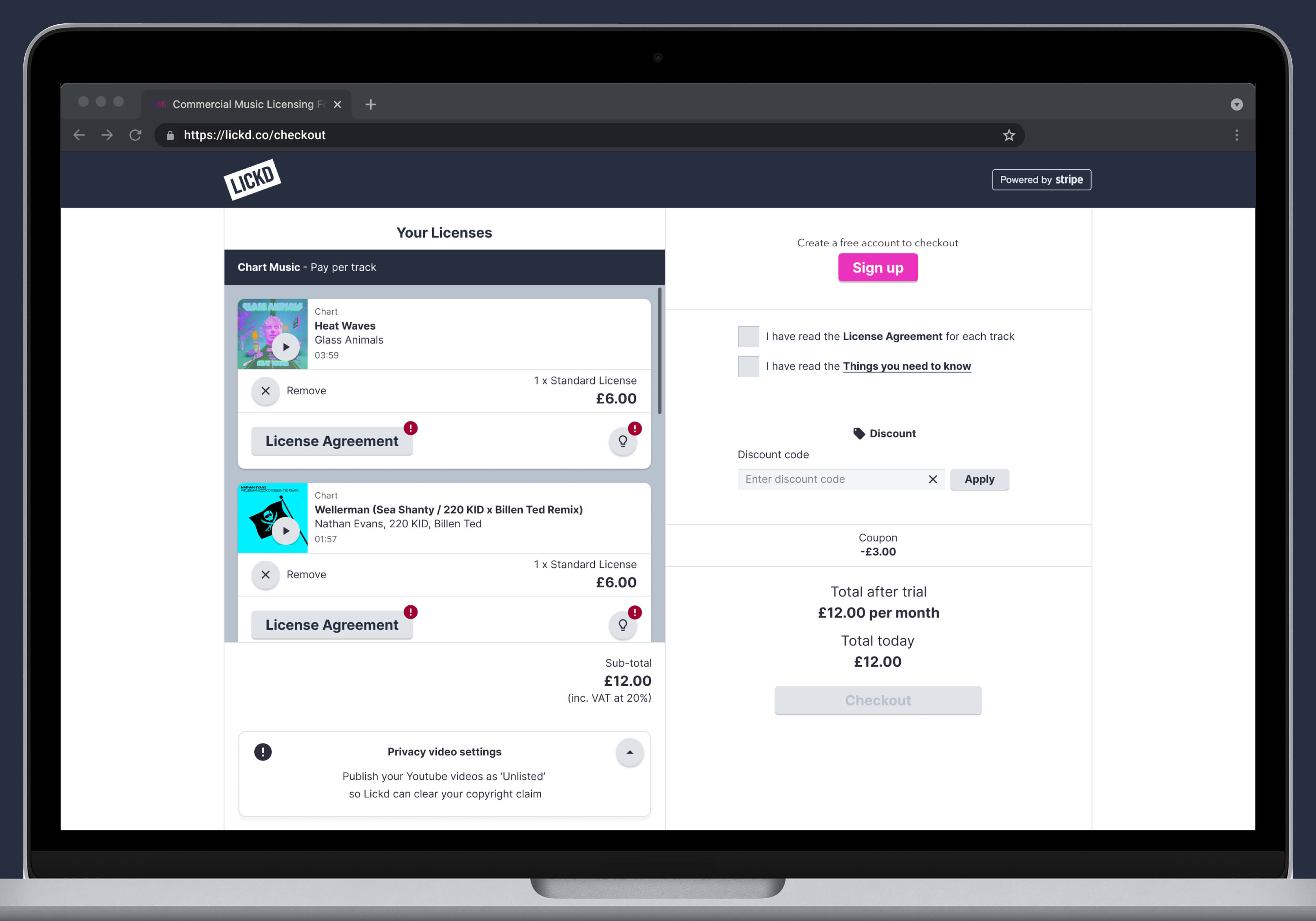
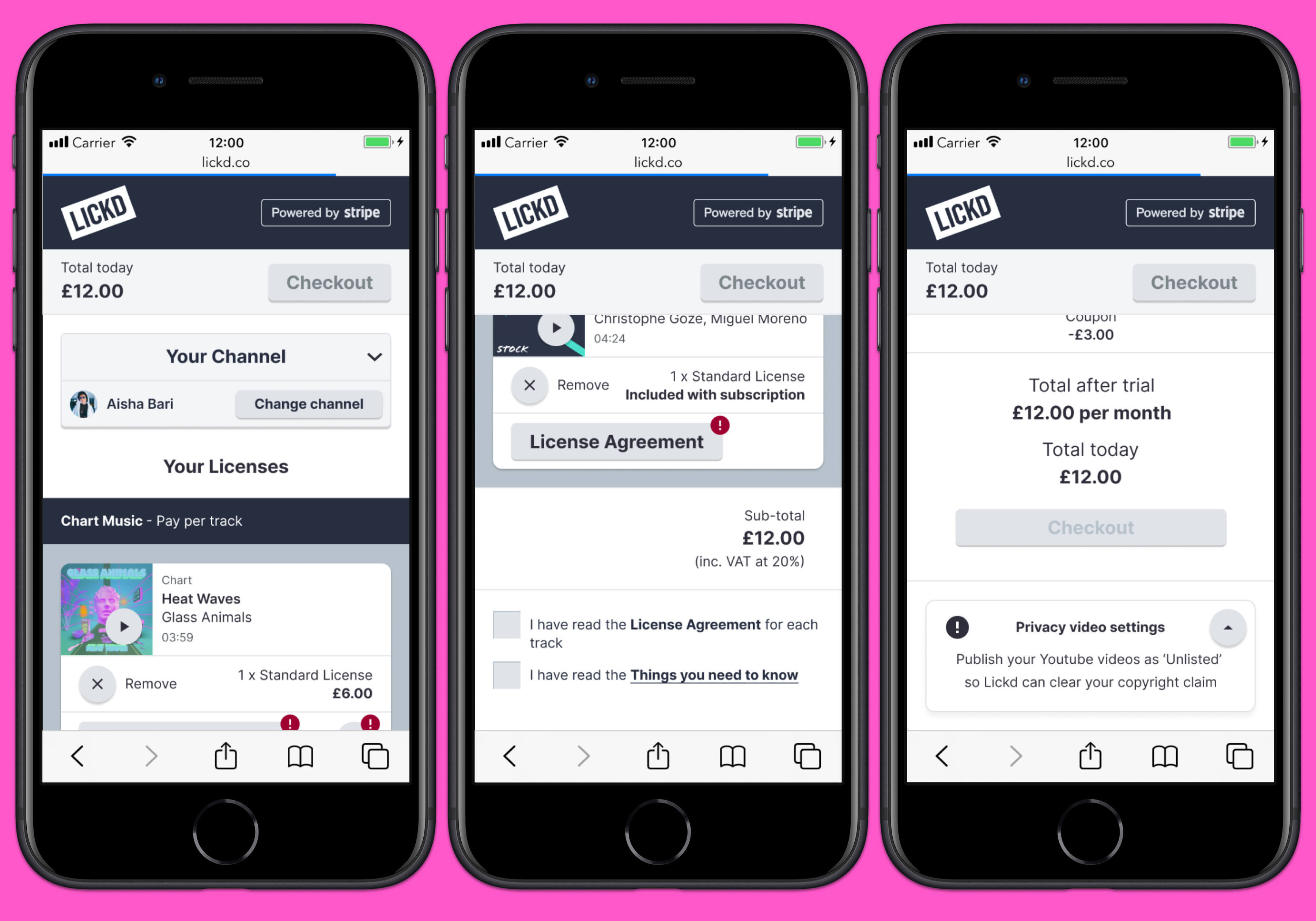
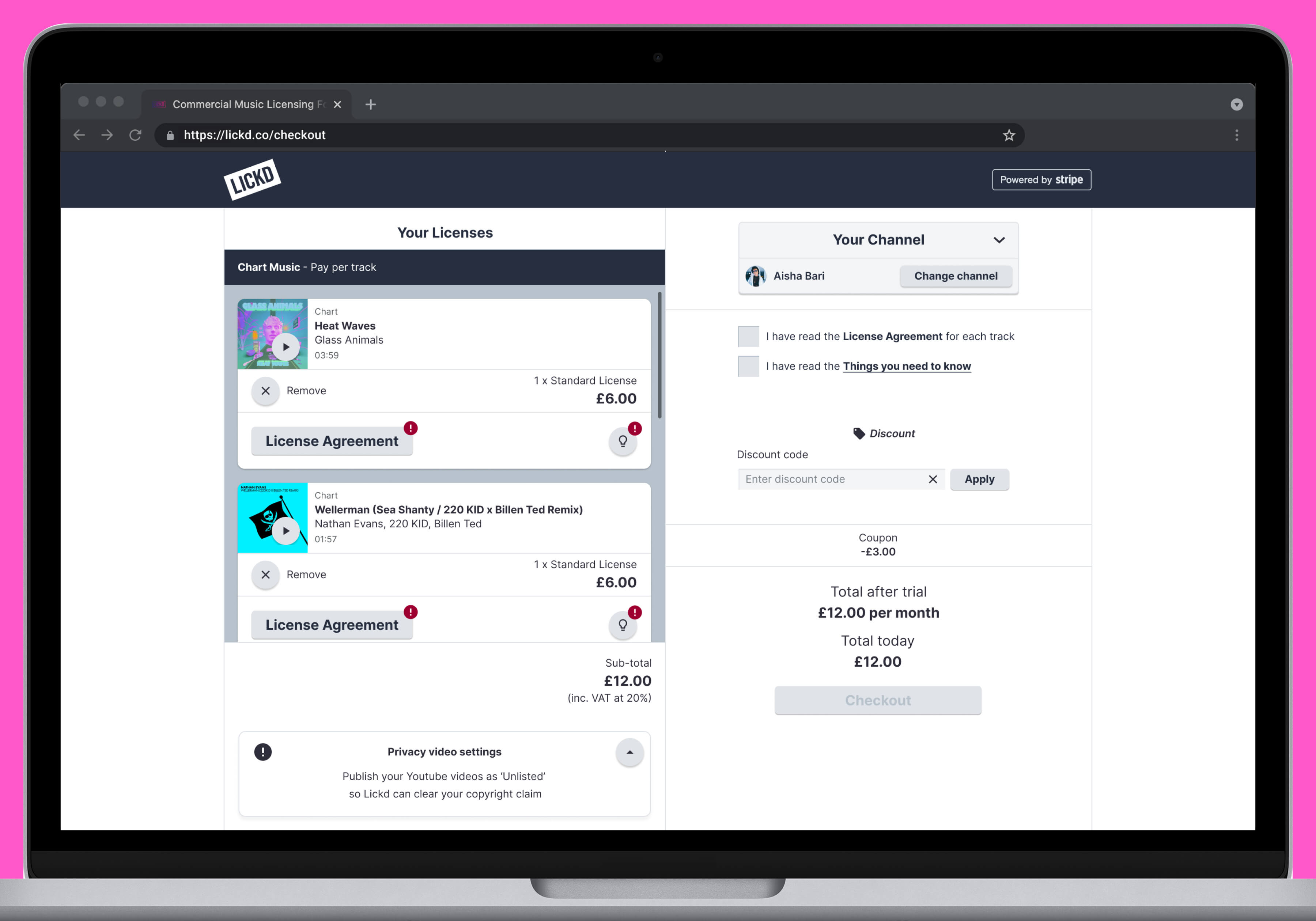
Mobile Designs - Checkout
Desktop Designs - Checkout
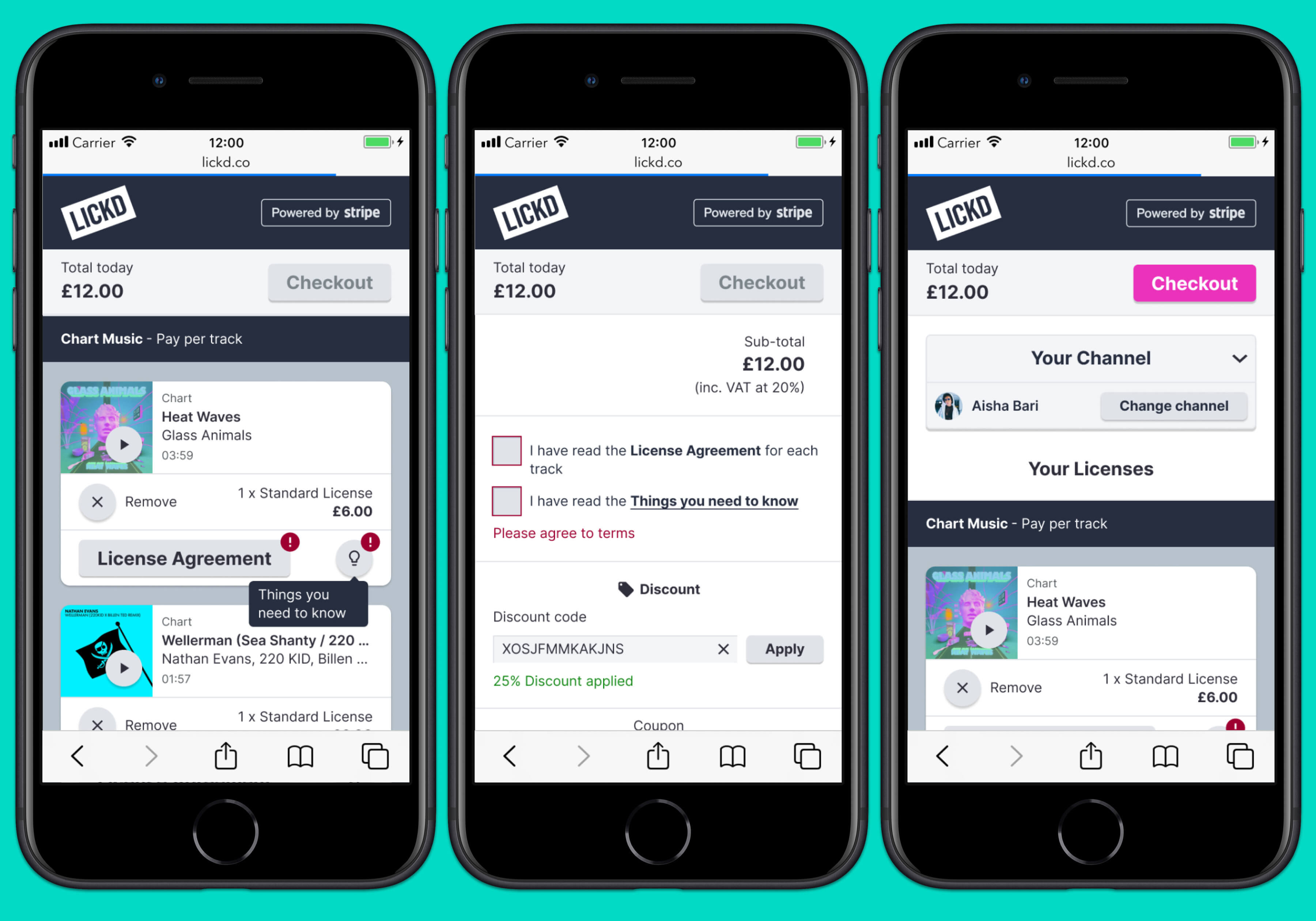
Mobile Designs - Checkout
Desktop Designs - Checkout
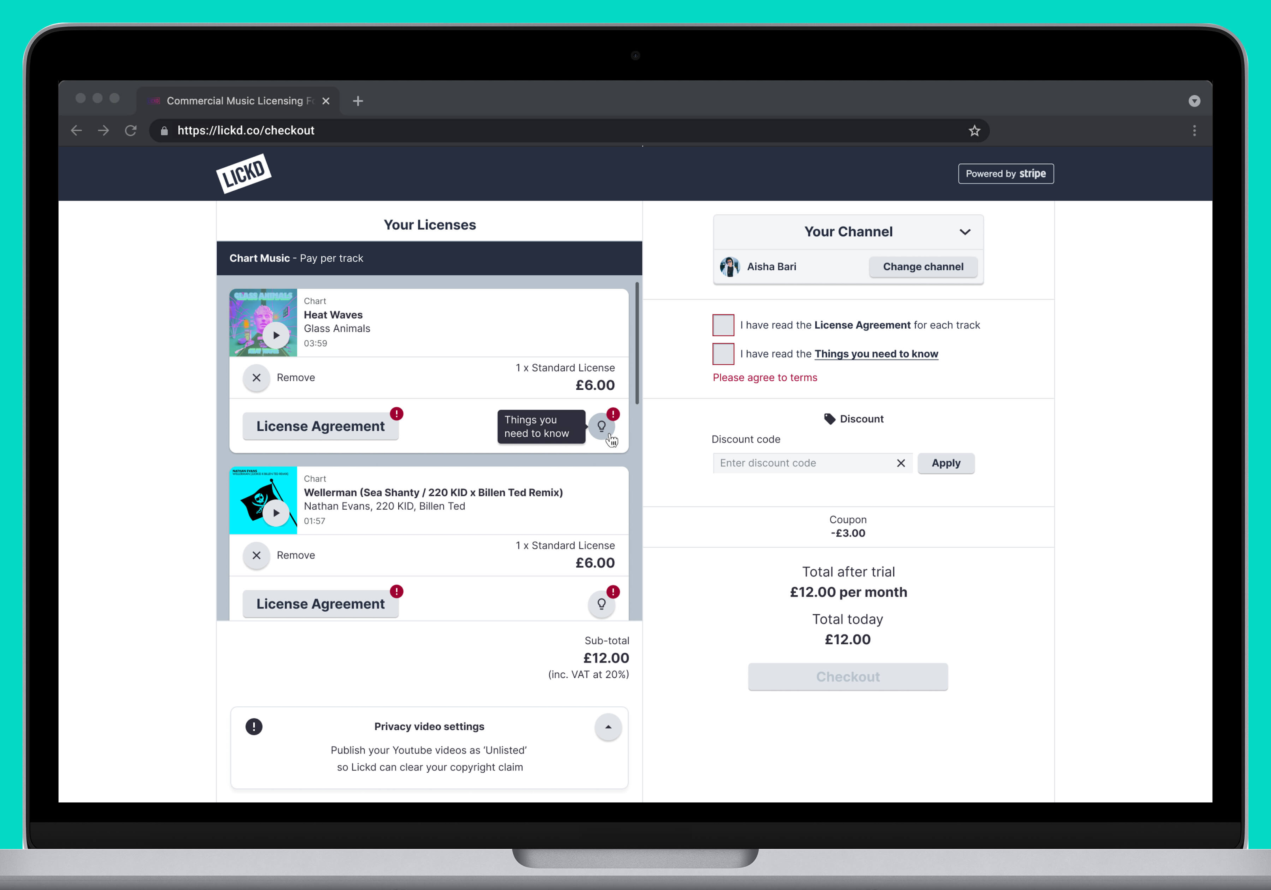
Mobile Designs - Checkout
Desktop Designs - Checkout
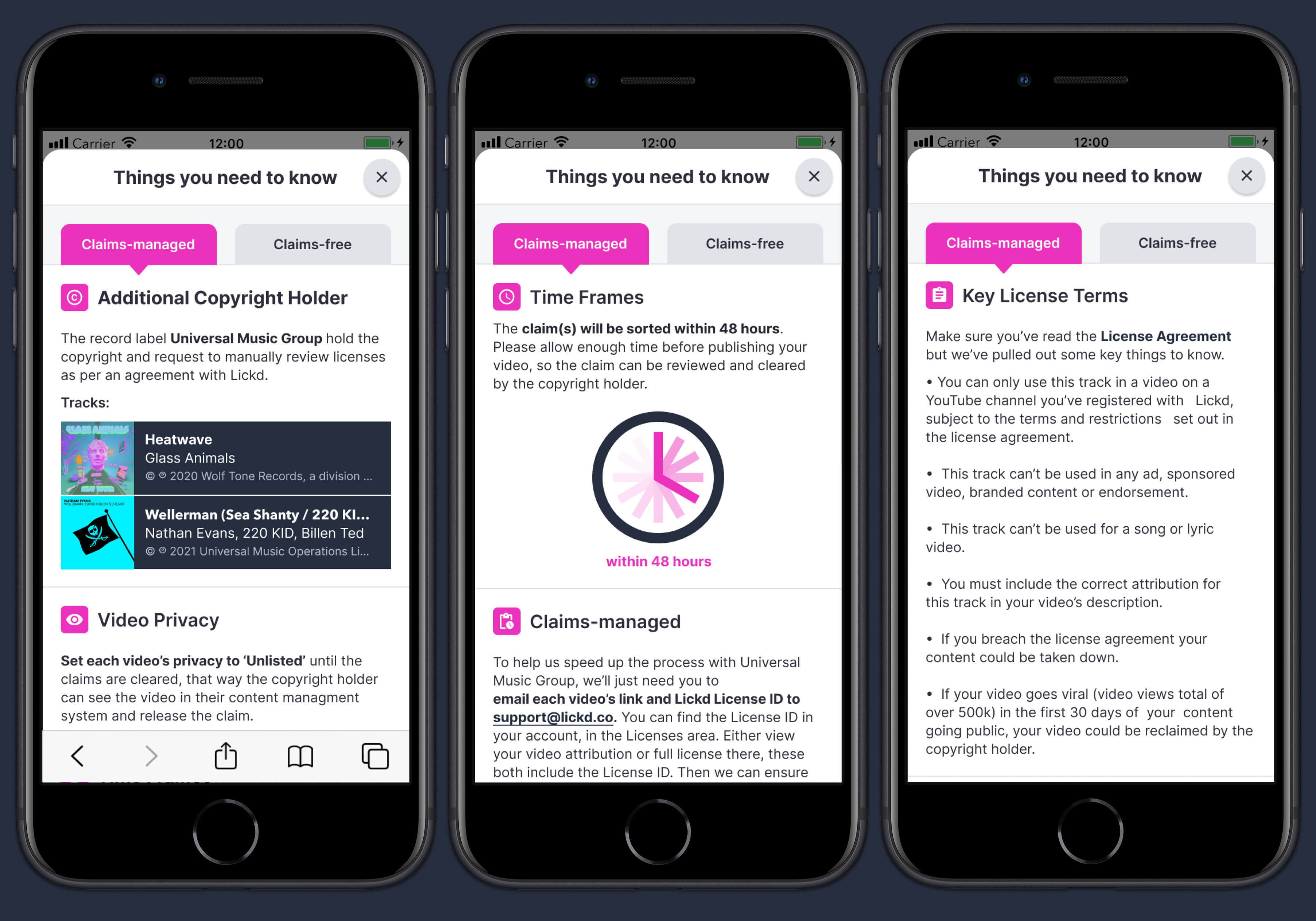
Mobile Designs - Things You Need To Know Popup Overlay
Desktop Designs - Things You Need To Know Popup Modal
Mobile Designs - Things You Need To Know Popup Overlay
Desktop Designs - Things You Need To Know Popup Modal
Mobile Designs - License Agreement Popup Overlay
Desktop Designs - License Agreement Popup Modal
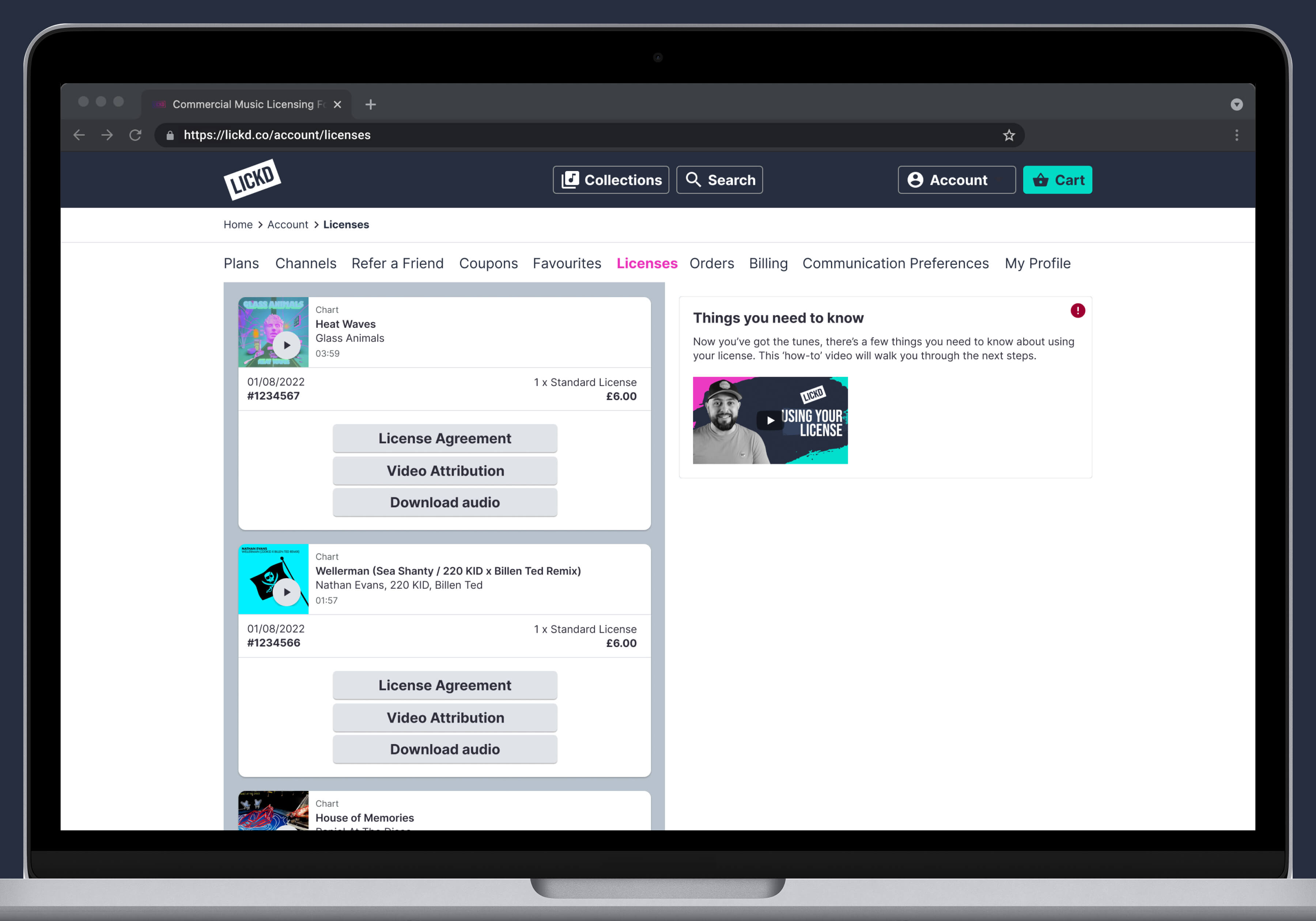
Mobile Designs - Licenses Page in Account
Desktop Designs - Licenses Page in Account
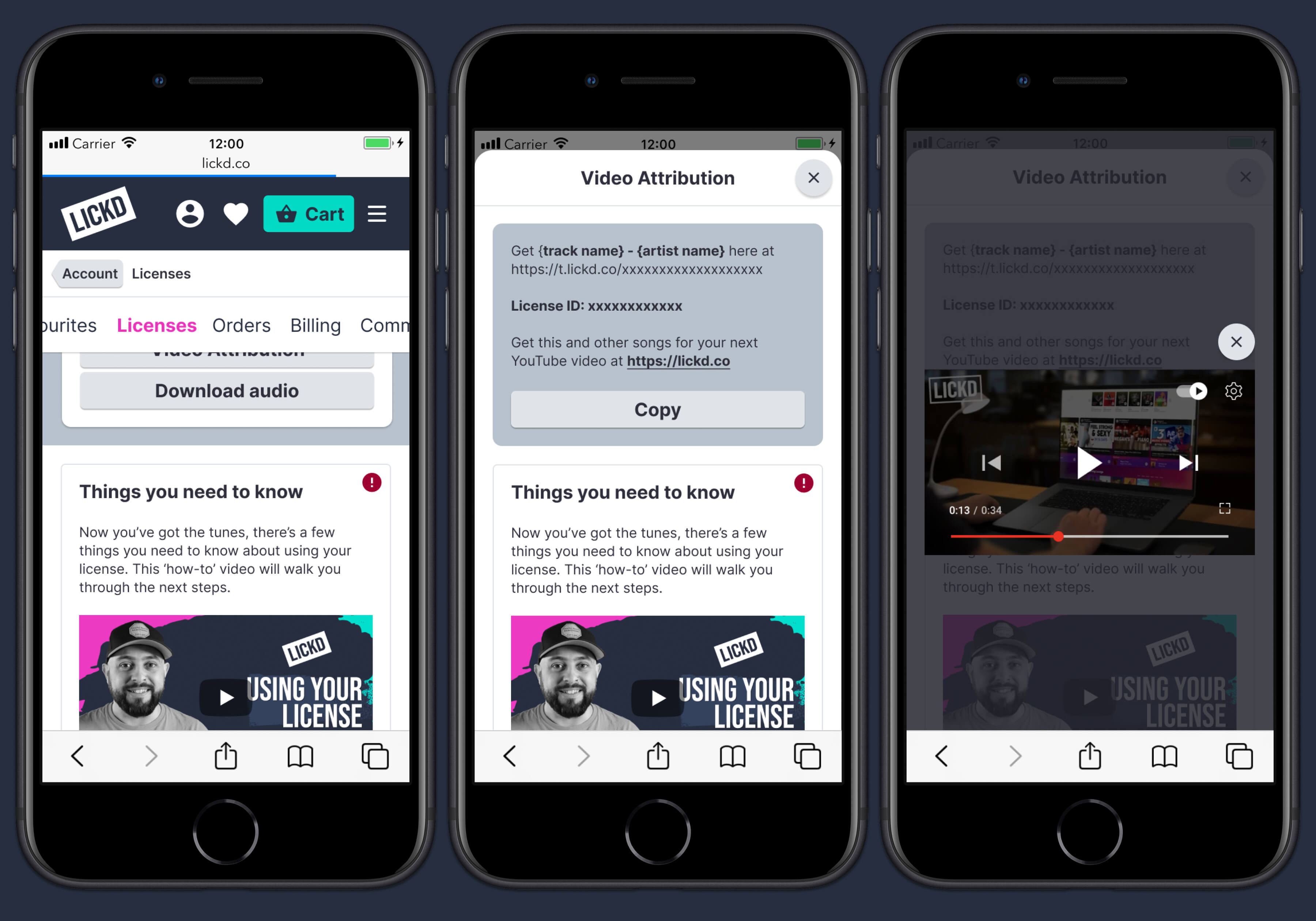
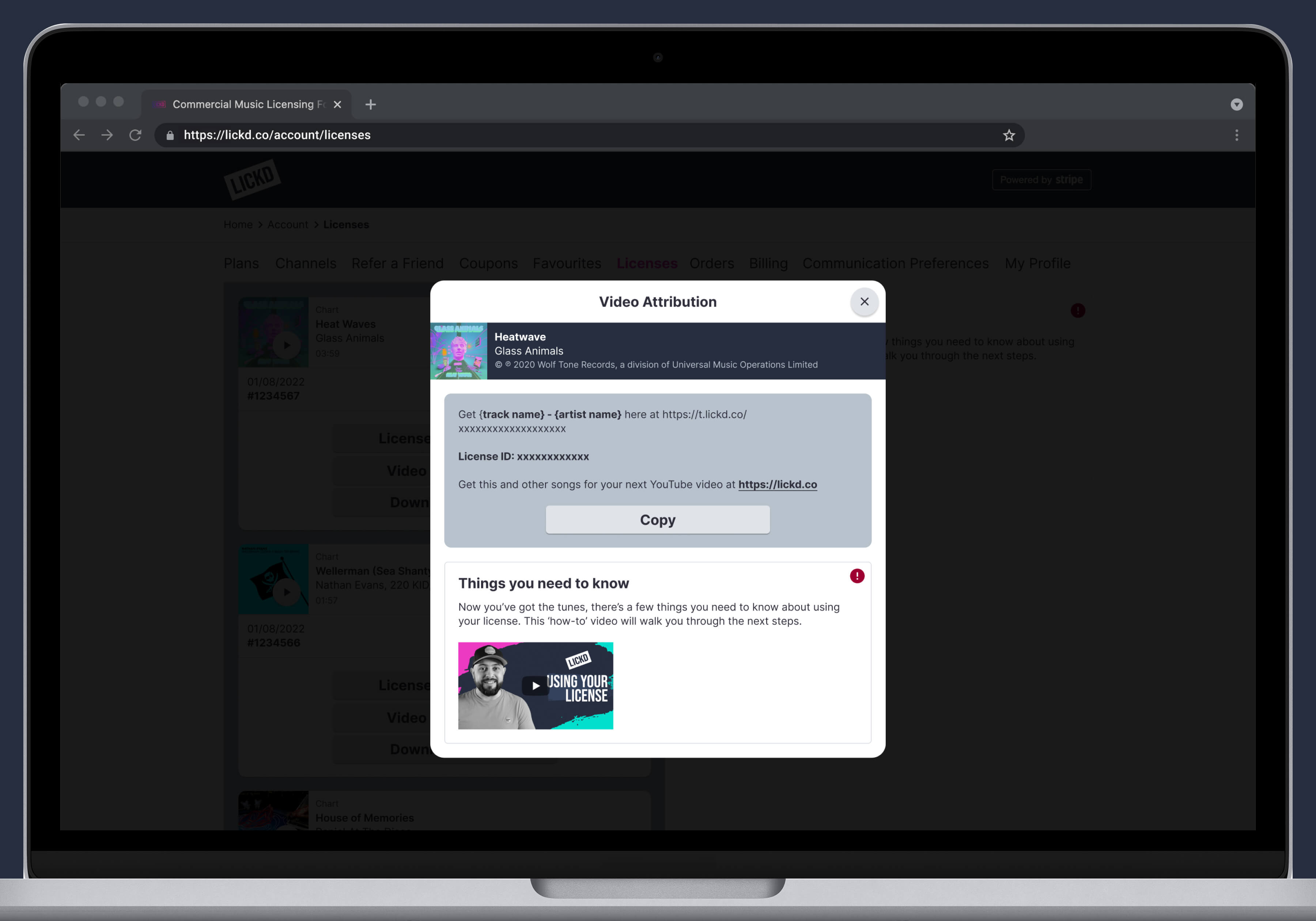
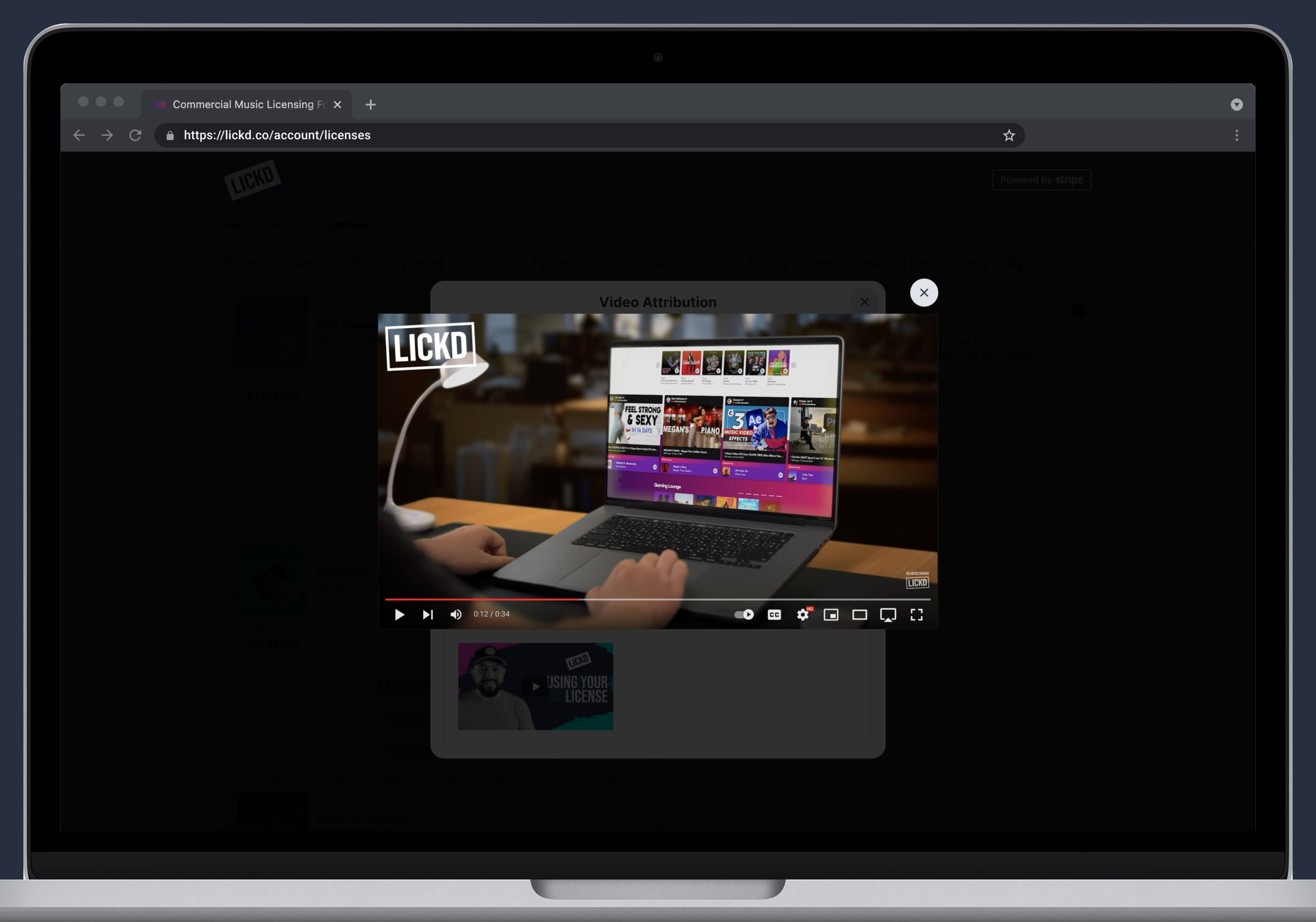
Desktop Designs - Video Attribution Popup Modal
Desktop Designs - Video Attribution Popup Overlay
Design System
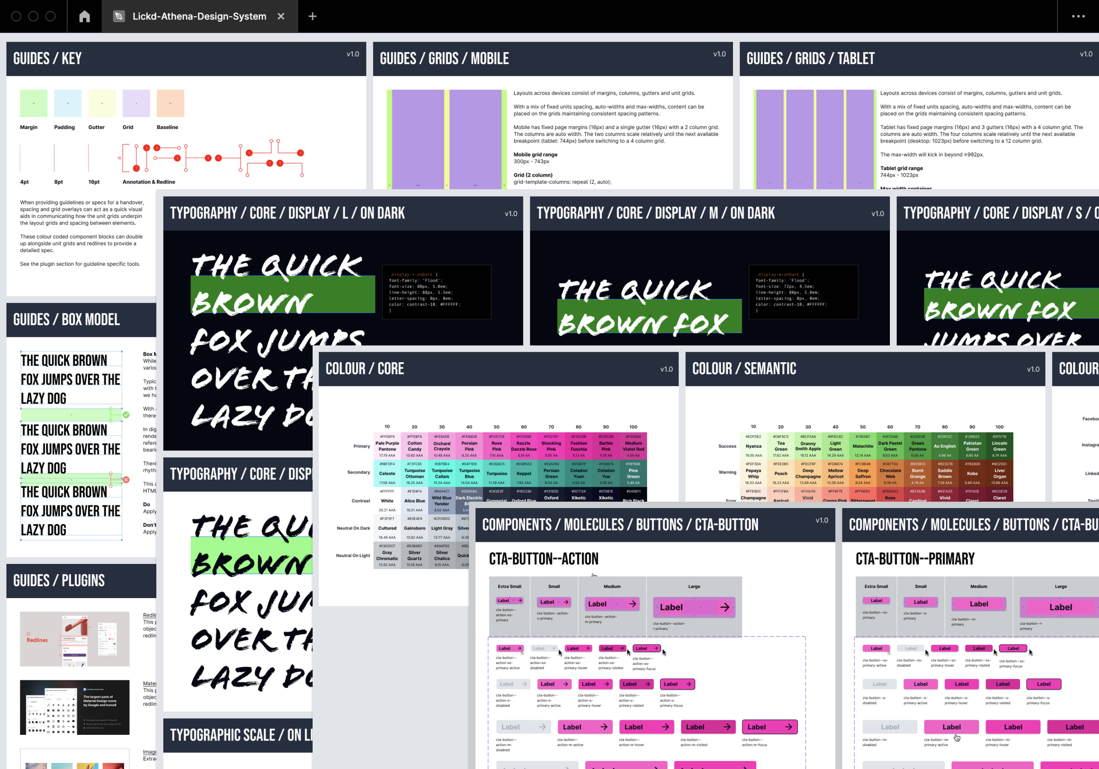
At Lickd, there had been a lot of change since my arrival and the UX/UI had evolved greatly over time. We still were a long way from being satisfied, as we had a lot of legacy components still living in the ecosystem. Since we had tried and tested a lot of design patterns and the frontend workflow had become a lot more streamlined, albeit within a small team, we felt it was time to build out a design system that would speed up agile production even more. I started with an audit of the platform, documenting all the inconsistencies across patterns and components. From here I could put together workshops with the engineering and product team and collectively decide what to keep, what to cull and come up with a new naming convention so the UI and codebase would be in sync plus could have a set of rules for future naming. We also decided it was a good time to migrate from Sketch to Figma so I started to rebuild legacy components (that we wanted to keep) as well as new additions that had been promoted as components, plus some guidelines and kits to help speed up design time. It was by no means finished by the time I moved on, but the framework was set up for further evolution and success.
Did the project meet its goals?
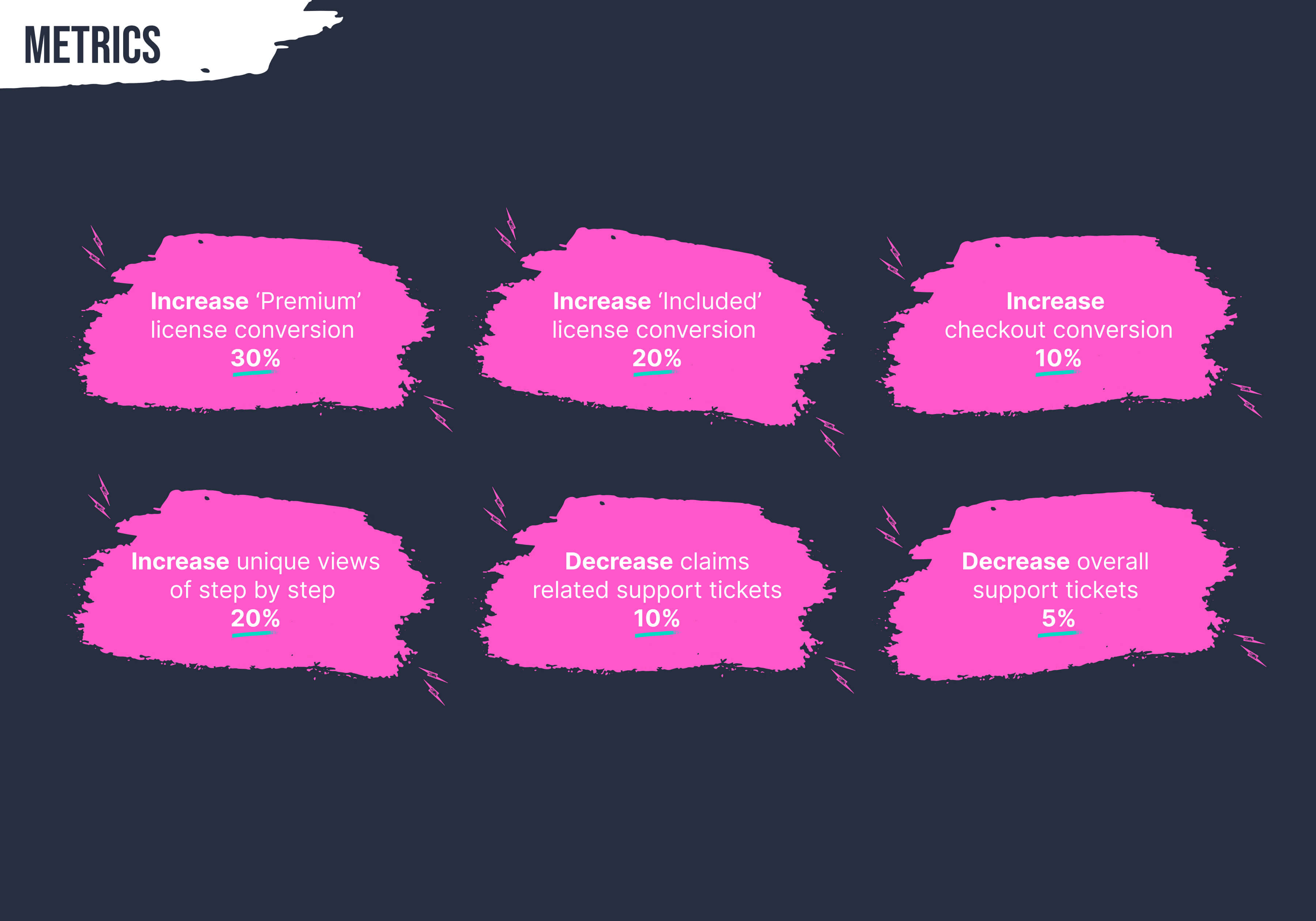
- Increased 'Premium' license order conversion to 43.5% (10% increase)
- Increased 'Included' license order conversion to 66% (10% increase)
- Decreased % of claims related tickets in a one month period -10%
- Decreased % of overall support tickets -1.45%
- Increased overall checkout conversion to 42.58% (5% increase)
- Increase % of unique views of 'Things you need to know' pop-up by 20%
Tradeoffs
- Being constrained by the fact Lickd business model includes two types of plans (pay per license and subscription), each of which use a different payment method and behaviour, this clearly adds another level of complexity when it comes to licence terms in general and for users that are onboarding for the first time, it can cause friction, this came up a lot during user testing which proved our assumptions right, but this was out of the product team's hands - all we could do is improve the labelling throughout the UI and make the onboarding process as clear as possible but this onbiously had a knock on affect when it came to conversion
- The compromise of conditional vs educational was a tricky balancing act when it came to ensuring the user viewed each track's license terms without putting adding obstacles during a focused area such as checkout. We felt the improvements we made guiding through each one with notifications, but could not force users to view all information as a mandatory exercise
- License agreements with record labels do vary so adding in another level of complexity for the manual claims process meant more information we needed to communicated in an already information rich experience due to it's nuances and infancy in the creator economy which made simplicity very difficult
- A company rebrand and a couple of product pivots meant the project took longer than anticipated
What I learnt from the experience
- Having regular time with users on a consistent basis makes a huge difference. Not only did we get amazing qualitative data in which we could be really agile and make tiny improvements from one prototype to the next, it also formed some really great relationships with the customers and they felt part of the journey that Lickd were on in solving a huge problem within the music tech and creator industry
- Having employees from different departments during discovery paid off in the long run and it also gave them a voice on big product calls
- A close collaboration with engineering is key as it keeps the MVP on track and realistic in terms of deliverables down the line (Now, Next, Later)